


Google’s plans for Android 15 are the reason Android users are feeling a deep sense of nostalgia. It’s been a decade since Google has prioritized a minimalist approach to status bar icons, but now that approach is about to be destigmatized and is a welcome update. On the way to implementing a modern approach to status bar icons.
It may take you a while to understand the whole picture but don’t let that discourage you from finding an untapped strength in this cutting-edge transformation. Google is going to add a level of depth to icons like battery and reception, just to give a chance to those who didn’t like it in the old version.
Seeing the new symbols at a glance can be a shocking realization as they can make the entire project seem like a step backward at first. Nonetheless, the point of arrival at this destination is the pursuit of a better user experience. First, consider a battery icon.
The percentage will now be easily visible in and around the battery, so you will be informed about the remaining charge very easily. Sample bars, similar to response bars, also show a more specific picture of the signal strength in the Wi-Fi network in your case.
It’s worth mentioning that this is likely to be more notable among Google Pixel devices. A variety of looks and feel can be found on Xiaomi or Samsung phones, which are made by the manufacturers; Because of the customization of your own Android experiences. Conversely, it would be reasonable to imagine a similar update for Google’s wearable operating system, which would create continuity in the company’s universe.
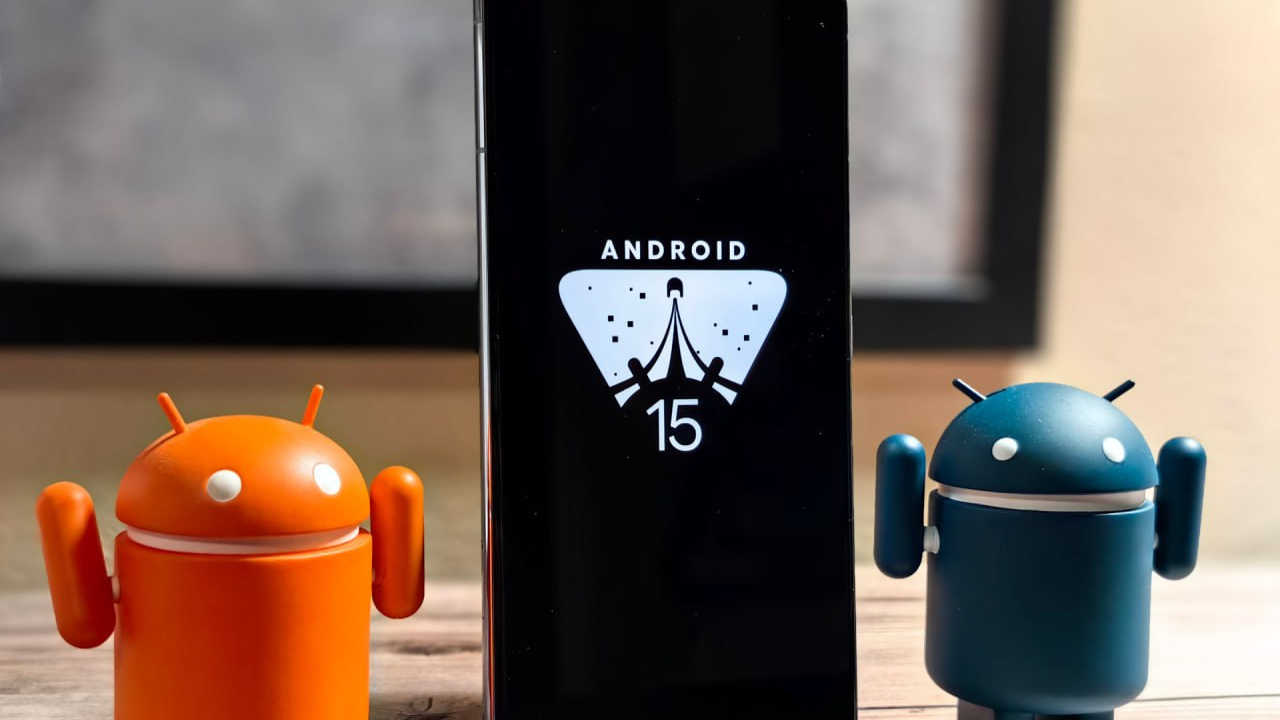
These new figures are set to be revealed with the unveiling of the latest Android 15. While minor changes are sure to be made to the beta version any time in the coming weeks the final design will be revealed.


